- >ASCII characters are not pixels: a deep dive into ASCII rendering
in general, ascii rendering is when ascii character codes are converted to pixels. if you wish to render other pixels onto a screen using characters, they are not ascii characters, they are roman or latin character glyphs, no ascii involved. that is all.
- Amazing post, I didn’t think this through a lot, but since you are normalizing the vectors and calculating the euclidean distance, you will get the same results using a simple matmul, because euclidean distance over normalized vectors is a linear transform of the cosine distance.
Since you are just interested in the ranking, not the actual distance, you could also consider skipping the sqrt. This gives the same ranking, but will be a little faster.
- Every example I thought "yeah, this is cool, but I can see there's space for improvement" — and lo! did the author satisfy my curiosity and improve his technique further.
Bravo, beautiful article! The rest of this blog is at this same level of depth, worth a sub: https://alexharri.com/blog
- I do enjoy these kinds of write ups, especially when it's about something that might seem so simple on the surface, but in order to get looking great you really have to go in deep.
Lucas Pope did a really nice write up on how he developed his dithering system for Return of The Obra Dinn. Recommended if you also enjoyed this blog post.
https://forums.tigsource.com/index.php?topic=40832.msg136374...
- > I don’t believe I’ve ever seen shape utilized in generated ASCII art, and I think that’s because it’s not really obvious how to consider shape when building an ASCII renderer.
Not to take away from this truly amazing write-up (wow), but there's at least one generator that uses shape:
https://meatfighter.com/ascii-silhouettify/
See particularly the image right above where it says "Note how the algorithm selects the largest characters that fit within the outlines of each colored region."
There's also a description at the bottom of how its algorithm works, if anyone wants to compare.
- Great article!
- > I don’t believe I’ve ever seen shape utilized in generated ASCII art, and I think that’s because it’s not really obvious how to consider shape when building an ASCII renderer.
Acerola worked a bit on this in 2024[1], using edge detection to layer correctly oriented |/-\ over the usual brightness-only pass. I think either technique has cases where one looks better than the other.
- Great work! While I was building ascii-side-of-the-moon [0][1] I briefly considered writing my own ascii renderer to capture differences in shade and shape of the Lunar Maria[2] better. Ended up just using chafa [3] with the hope of coming back to ascii rendering after everything is working end to end.
Are you planning to release this as a library or a tool, or should we just take the relevant MIT licensed code from your website [4]?
[0] https://aleyan.com/projects/ascii-side-of-the-moon
[1] https://news.ycombinator.com/item?id=46421045
[2] https://en.wikipedia.org/wiki/Lunar_mare
- Great breakdown and visuals. Most ASCII filters do not account for glyph shape.
It reminds me of how chafa uses an 8x8 bitmap for each glyph: https://github.com/hpjansson/chafa/blob/master/chafa/interna...
There's a lot of nitty gritty concerns I haven't dug into: how to make it fast, how to handle colorspaces, or like the author mentions, how to exaggerate contrast for certain scenes. But I think 99% of the time, it will be hard to beat chafa. Such a good library.
EDIT - a gallery of (Unicode-heavy) examples, in case you haven't seen chafa yet: https://hpjansson.org/chafa/gallery/
- Very cool effect!
> It may seem odd or arbitrary to use circles instead of just splitting the cell into two rectangles, but using circles will give us more flexibility later on.
I still don’t really understand why the inner part of the rectangle can’t just be split in a 2x3 grid. Did I miss the explanation?
- I didn’t put nearly as much effort as this post into shape matching but I did try a few other things like
Non-ascii, I tried various subsets of Unicode. There’s the geometric shape area, CJK, dingbats, lots of others
Different fonts - there are lots of different monospace fonts. I even tried non-monospaced fonts tho still drawn in grid
ANSI color style https://16colo.rs/
My results weren’t nearly as good as the ones in this article but just suggesting more ways of exploration
https://greggman.github.io/doodles/textme10.html
Note: options are buried in the menu. Best to pick a scene other than the default
- Fantastic technique and deep dive. I will say, I was hoping to see an improved implementation of the Cognition cube array as the payoff at the end. The whole thing reminded me of the blogger/designer who, years ago, showed YouTube how to render a better favicon by using subpixel color contrast, and then IIRC they implemented the improvement. Some detail here: https://web.archive.org/web/20110930003551/http://typophile....
- Fantastic article! I wrote an ASCII renderer to show a 3D Claude for my Claude Wrapped[^1], and instead of supersampling I just decided to raymarch the whole thing. SDFs give you a smoother result than even super sampling, but of course your scene has to be represented with distance functions and combinations thereof whereas your method is generally applicable.
Taking into account the shape of different ASCII characters is brilliant, though!
- Great article!
I think there's a small problem with intermediate values in this code snippet:
Replace x by value.const maxValue = Math.max(...samplingVector) samplingVector = samplingVector.map((value) => { value = x / maxValue; // Normalize value = Math.pow(x, exponent); value = x * maxValue; // Denormalize return value; }) - The contrast enhancement seems simpler to perform with an unsharp mask in the continuous image.
It probably has a different looking result, though.
- Only tangentially related, but the title reminds me of hack you could do on old DOS machines to get access to a 160x100 16-color display mode on a CGA graphics adapter.
The display mode is actually a hacked up 80x25 text mode. So in that specific narrow case, you have a display mode where text characters very much function as pixels.
- Quite amazing breakdown, thank you!
I'm hoping people who harness ASCII for stuff like this consider using Code Page 437, or similar. Extended ASCII sets comprising Foreign Chars are for staid business machines, and sort of familiar but out of place accented chars have a bit of a distracting quality.
437 and so on taps the nostalgia for BBS Art, DOS, TUIs scene NFOs, 8 bit micros.... Everything pre Code Page 1252, in other words. Whilst it was a pragmatic decision for MS, it's also true that marketing needs demanded all text interfaces disappeared because they looked old. Text graphics, doubly so. That design space was now reserved for functional icons. A bit of creativity went from (home) computing right there and then. Stuffing it all into a separate font ensured it died.
But, that stuff is genuinely cool to a lot of people in a way VIM, (for example) has never been and nor will it ever. This is a case of Form Over Function. Foreign chars are not as friendly or fun as hearts, building blocks, smileys, musical notes, etc.
- I'm playing with a related problem in my spare time - braille character-based color graphics; while we have enough precision for sharp edges, the fundamental issues with color are the still the same: if we begin with a supersampling pass for assignment, we lack precision, so we may need to do some contrast fixups afterward. I think some contrast enhancement based on your sampling schemes might be useful :) Thank you so much for posting this!
(I've previously tried pre-transforming on the image side to do color contrast enhancement, but without success: I take the Sobel filter of an image, and use it to identify regions where I boost contrast. However, since this is a step preceding "rasterization", the results don't align well with character grids.)
- Great writeup! I put together a Python CLI implementation: https://github.com/mayz/ascii-renderer
Supports color output, contrast enhancement, custom charsets. MIT licensed.
- There is already a C library that does realtime ascii rendering using décision trees:
GitHub: https://github.com/symisc/ascii_art/blob/master/README.md Docs: https://pixlab.io/art
- This is amazing all round - in concept, writing, and coding (both the idea and the blog post about it).
I feel confident stating that - unless fed something comprehensive like this post as input, and perhaps not even then - an LLM could not do something novel and complex like this, and will not be able to for some time, if ever. I’d love to read about someone proving me wrong on that.
- Amazing post, I was able to take what you did and recreate it and have some fun, matrix green etc. Thanks for the great post
- really great! adjacent well-done ASCII using Braille blocks on X this week:
nolen: "unicode braille characters are 2x4 rectangles of dots that can be individually set. That's 8x the pixels you normally get in the terminal! anyway here's a proof of concept terminal SVG renderer using unicode braille", https://x.com/itseieio/status/2011101813647556902
ashfn: "@itseieio You can use 'persistence of vision' to individually address each of the 8 dots with their own color if you want, there's some messy code of an example here", https://x.com/ashfncom/status/2011135962970218736
deleted
- Wonderful article and illustrations! I got sucked in by the successive disclosures of "but this is a problem, so we do that to solve it." Bravo!
deleted
- It would be interesting to see how things changed if you included extended ascii characters [1], which were widely used for ascii UI.
- > To increase the contrast of our sampling vector, we might raise each component of the vector to the power of some exponent.
How do you arrive at that? It's presented like it's a natural conclusion, but if I was trying to adjust contrast... I don't see the connection.
- I dunno, going to the last example at the bottom of the page and comparing the contrast slider all the way up and all the way down, all these enhancements combined turns it into a blurry mush where it's harder to distinguish the shapes. It's the exact same problem I had with anti-aliasing fonts on older monitors (smaller resolutions) and why I always disabled it wherever I could.
- What a great post. There is an element of ascii rendering in a pet project of mine and I’m definitely going to try and integrate this work. From great constraints comes great creativity.
- This is such a great article!
I found myself thinking, “I wonder if some of this could be used to playback video on old 8-bit machines?” But they’re so underpowered…
- Very impressive blogpost. No wonder it took 6 months. Makes me think I need to step up the game with my photo ASCII art compositor, printscii.com
- It reminds me quite a bit of collision engines for 2D physics/games. Could probably find some additional clever optimisations for the lookup/overlap (better than kd-trees) if you dive into those. Not that it matters too much. Very cool.
- I did something very similar to this (searching for similar characters across the grid, including some fuzzy matching for nearby pixels) around 1996. I wonder if I still have the code? It was exceedingly slow, think minutes for a frame at the Pentiums of the time.
- I'm not sure if this exponent is actually enhancing contrast or just fixing the gamma.
- It's important to note that the approach described focuses on giving fast results, not the best results.
Simply trying every character and considering their entire bitmap, and keeping the character that reduces the distance to the target gives better results, at the cost of more CPU.
This is a well known problem because early computers with monitors used to only be able to display characters.
At some point we were able to define custom character bitmap, but not enough custom characters to cover the entire screen, so the problem became more complex. Which new character do you create to reproduce an image optimally?
And separately we could choose the foreground/background color of individual characters, which opened up more possibilities.
- Mesmerizing, the i, ! shading is unreasonably effective.
- Those 3D interactive animations are the smoothest 3D rendering I've ever seen in a mobile browser. I'm impressed
- Nice work! ASCII rendering will never be the same, in a good way.
- that was so brilliant! i loved it! thanks for putting it out :)
- This is something I've wanted to do for 50 years, but never found the time or motivation. Well done!
- Wow. Pretty cool. Now just replace the characters with the set from the Matrix and swallow the blue pill.
- Tell me someone has turned this into a library we can use
- This at the same time super cool and really disappointing, as I've been carrying around this idea in my head for maybe ten years as a cool side project and never got around to implementing it.
However, there might still be room for competition, heh. I always wanted to do this on the _entirety_ of Unicode to try getting the most possible resolution out of the image.
- very cool. I may have to look a bit closer at the pipeline I used to create the art at ssh funky.nondeterministic.computer. The graphics could always be improved, however I will note that it needs color for best effect.
- Application error: a client-side exception has occurred (see the browser console for more information).
- This is fantastic
- Holy moly, i Love this kinds of work
- Thanks! This article put a genuine smile on my face, I can still discover some interesting stuff on the Internet beyond AI slop.
- Well-written post. Very interesting, especially the interactive widgets.
- I love that they don't just work on the edges and declare their work complete. No, shadows also have to be perfect!
Reminds me of this underrated library which uses braille alphabet to draw lines. Behold:
https://github.com/tammoippen/plotille
It's a really nice plotting tool for the terminal. For me it increases the utility of LLMs.
- Nice! Now add colors and we can finally play Doom on the command line.
More seriously, using colors (not trivial probably, as it adds another dimension), and some select Unicode characters, this could produce really fancy renderings in consoles!
- Seems like stellar work. Kudos.
I am however am struck with the from an outsider POV highly niche specific terminology used in the title.
"ASCII rendering".
Yes, I know what ASCII is. I understand text rendering in sometimes painful detail. This was something else.
Yes, it's a niche and niches have their own terminologies that may or may not make sense in a broader context.
HN guidelines says "Otherwise please use the original title, unless it is misleading or linkbait; don't editorialize."
I'm not sure what is the best course of action here - perhaps nothing. I keep bumping into this issue all the time at HN, though. Basically the titles very often don't include the context/niche.
- Next up: proportional fonts and font weights?
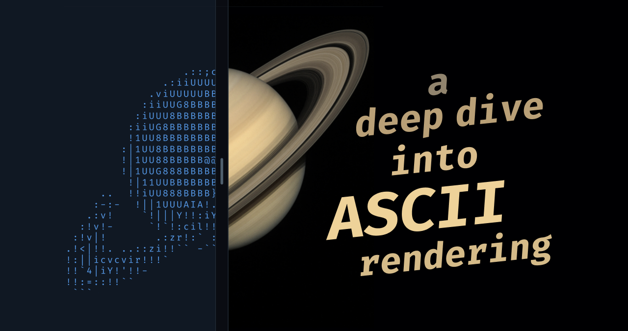
- > The image of Saturn was generated with ChatGPT.
Wait...wh...why?!? Of all the things, actual pictures of the planet Saturn are readily available in the public domain. Why poison the internet with fake images of it?
- Hmm. This renderer is impressive. Will it be available for toy projects? (such as an online page with JavaScript for converting family pictures)